Multiple Choice Component
The multiple choice component has the same functionality as the choice component, but with the repeating capability of a chunk. It can contain non-structural components and/or pieces among its options, which allows for powerful, flexible polymorphic content.

Multiple Choice Component Usage
When adding this component to a shape or piece, you can specify the following:
- Name (required) - A name for the component.
- Identifier - String that will be generated based on the component name when shape/piece is created or updated. You’ll use the identifier to reference the component programmatically.
- Localized Structure - If set to Yes, then the chosen components and their content may vary for each language configured within your tenant, and all components within the multiple choice will automatically have their localization properties set to Yes as well. If set to No, then the same components/content will be shared across languages, and different localization properties can be assigned individually to each nested component.
- Component(s)/Piece(s) - At least one component or piece must be added to the multiple choice. You can click and drag to reorder components/pieces, or use the action button (...) to delete them.
Based on your configurations, the multiple choice component will be labeled with either “Unified Structure” (same choices/content for all languages) or “Localized structure” (the choices/content may differ across languages).
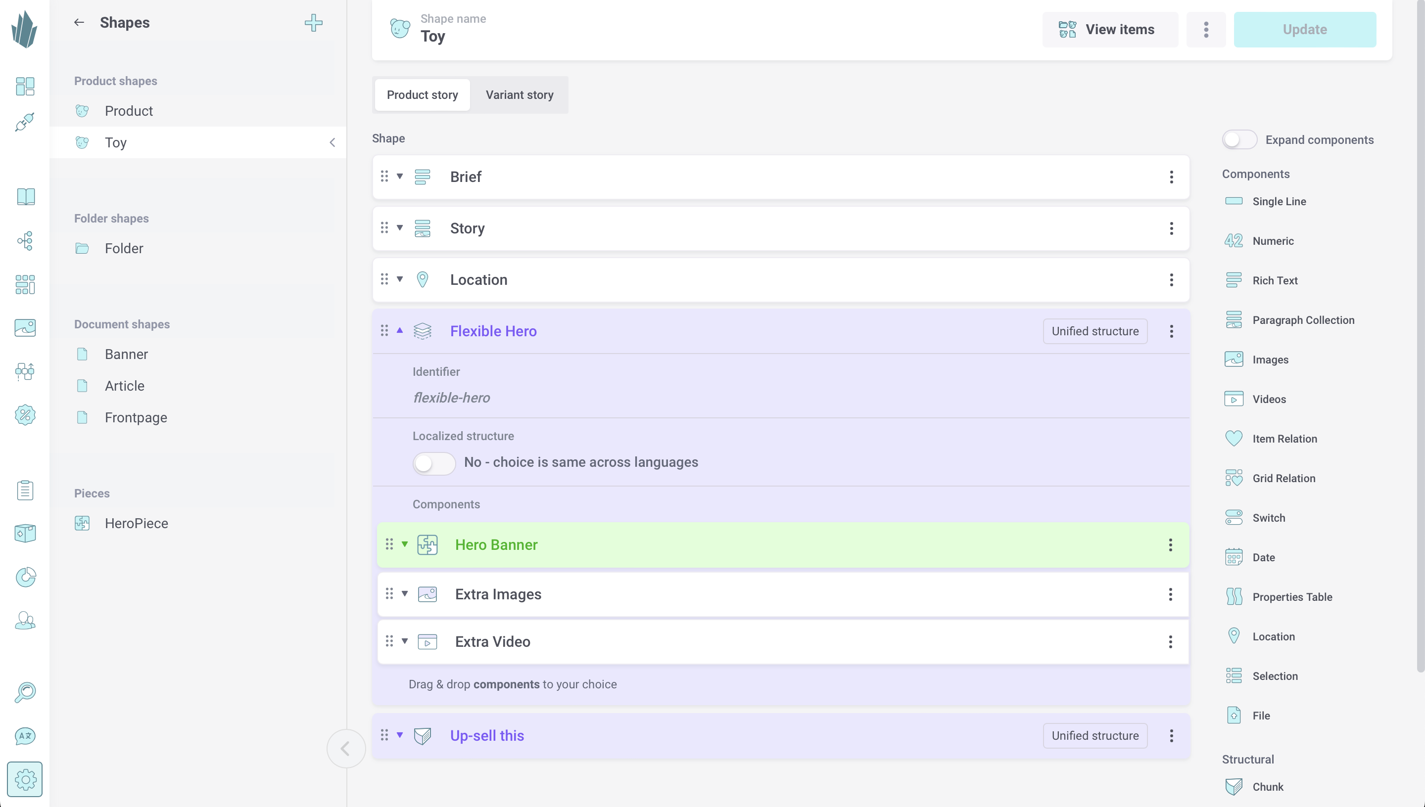
Click and drag components and/or pieces (if defined) to add them to the multiple choice component. You can click and drag to reorder components/pieces, or use the action button (...) to delete them. Below is an example of a "flexible hero" element that will allow content editors to arrange banners, images, and videos as desired for each product based on this shape.

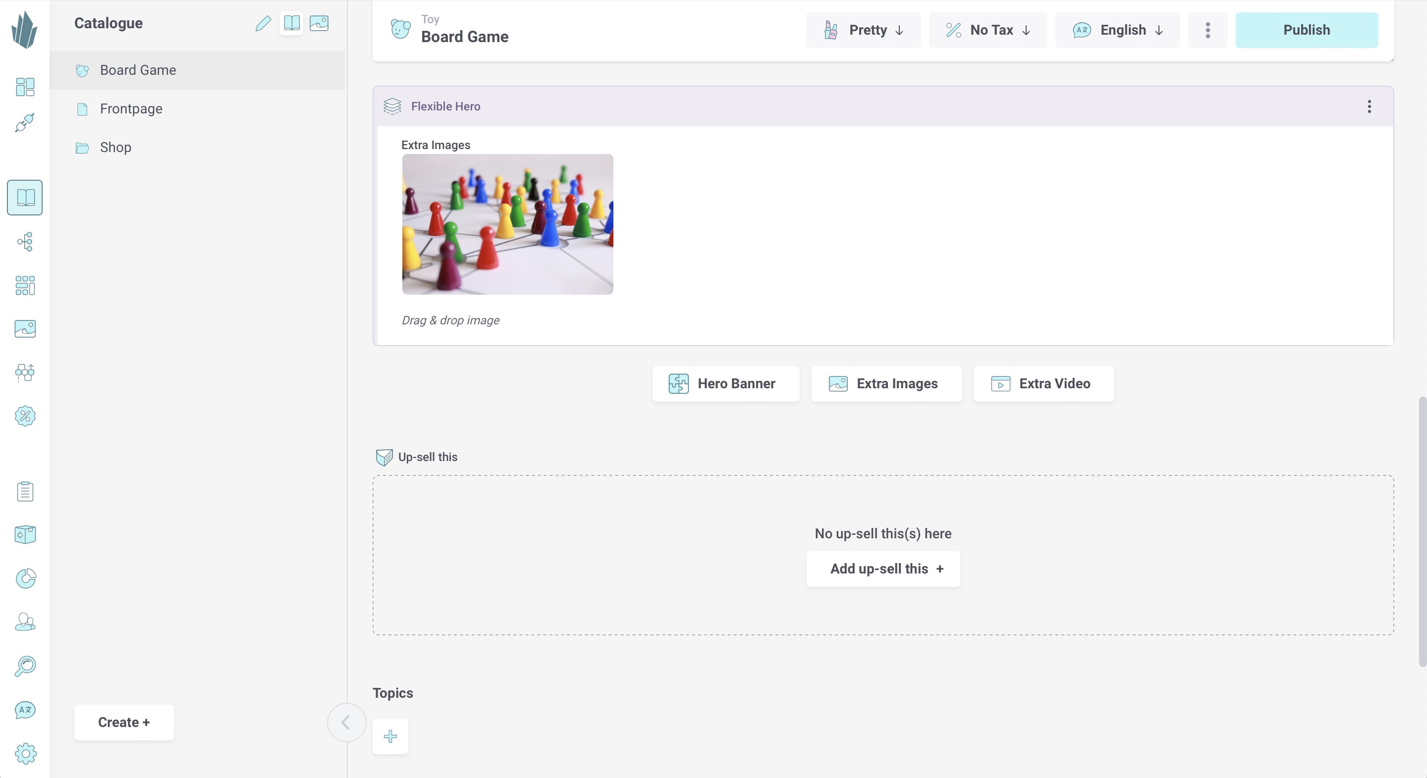
When editing an item based on this shape, click the button for the desired choice. The choice buttons will persist, allowing you to choose again if desired. Hovering your mouse over a chosen component will reveal buttons that allow you to add a new choice above this one, click and drag to reorder, or remove the chosen component. The action button (...) on the multiple choice component's frame allows you to remove all components. Once removed, a component's data is lost, so proceed carefully with deletion.

Nesting With Multiple Choice
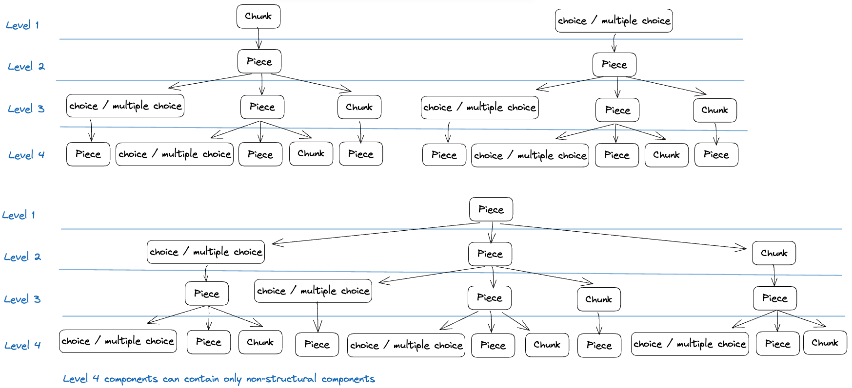
Multiple choice components come with a powerful nesting capability that mirrors that of the choice component. You can add them to pieces to create sophisticated multi-level structures. Currently, four levels of nesting are supported. The diagram below shows the different combinations that are possible between pieces and structural components.
The components on the fourth level of nesting may only contain non-structural components. A non-structural component is any component that isn't a chunk or choice, such as single line or rich text. A full list of non-structural components can be found here.

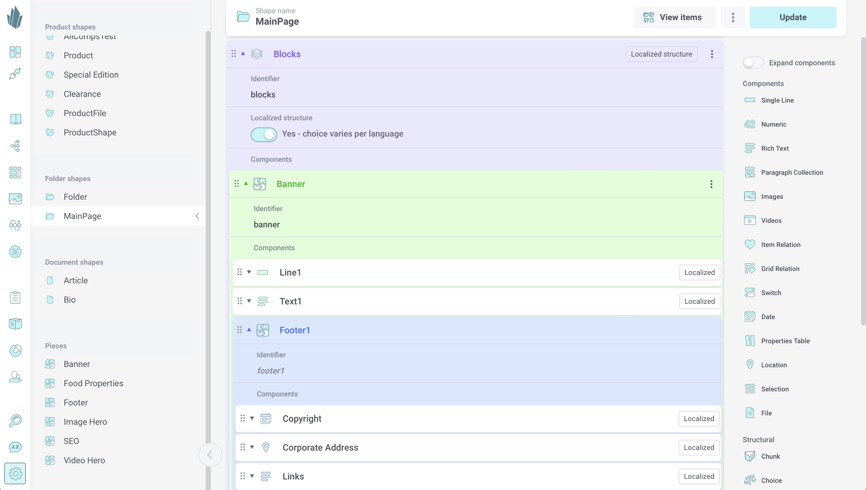
The screenshot below shows an example of nested structures for flexible marketing content.

Catalogue API Access
Once created, multiple choice components and their content are accessible via the Catalogue API. Refer to our sample query for retrieving multiple choice component content, and to the API docs at https://api.crystallize.com/your-tenant-identifier/catalogue for more information.
