Populating Your Product Catalogue - the Core of PIM + CMS
Once you’ve planned out your information architecture with content modeling and defined the shapes you need, it’s now time to fill your Crystallize catalogue with your awesome product and marketing content.
Browse through our demo furniture tenant to see what a well-organized and detailed catalogue allows you to do. The sections labeled “Shop,” “Stories,” and “About,” as well as subsections like “Plants” and “Chairs,” are defined by a hierarchy of folders. Within these folders and subfolders are many examples of products (furniture, plants, etc.) and documents (articles on various design styles). The products and documents have tags associated with them (ex. color, materials) that have been defined by topic maps. On the main page, you can scroll down to “Today’s Trending Plants” to see an example of a grid organizer in action. Everywhere you look, you see beautiful assets like images, bringing product and marketing content to life.
As you can see, your catalogue is not just a repository for data and content. It can also form the foundation of your frontend navigation and allow you to define relationships between your products based on common attributes. These relationships can potentially be used to power advanced search filters or suggest related products to customers.
We’ll now see how you can start implementing your own catalogue within the Crystallize App.
Starting Out With the Catalogue
To perform these actions within your tenant, you’ll first need the requisite permissions for the Tree (item access, publishing, deletion, etc). Refer to our documentation on roles and permissions for more information.
Once you have the necessary access, click the Catalogue button on the left-hand side of the screen. You can also bring up the command palette with [CTRL or ⌘] + K and type or select "Catalogue."
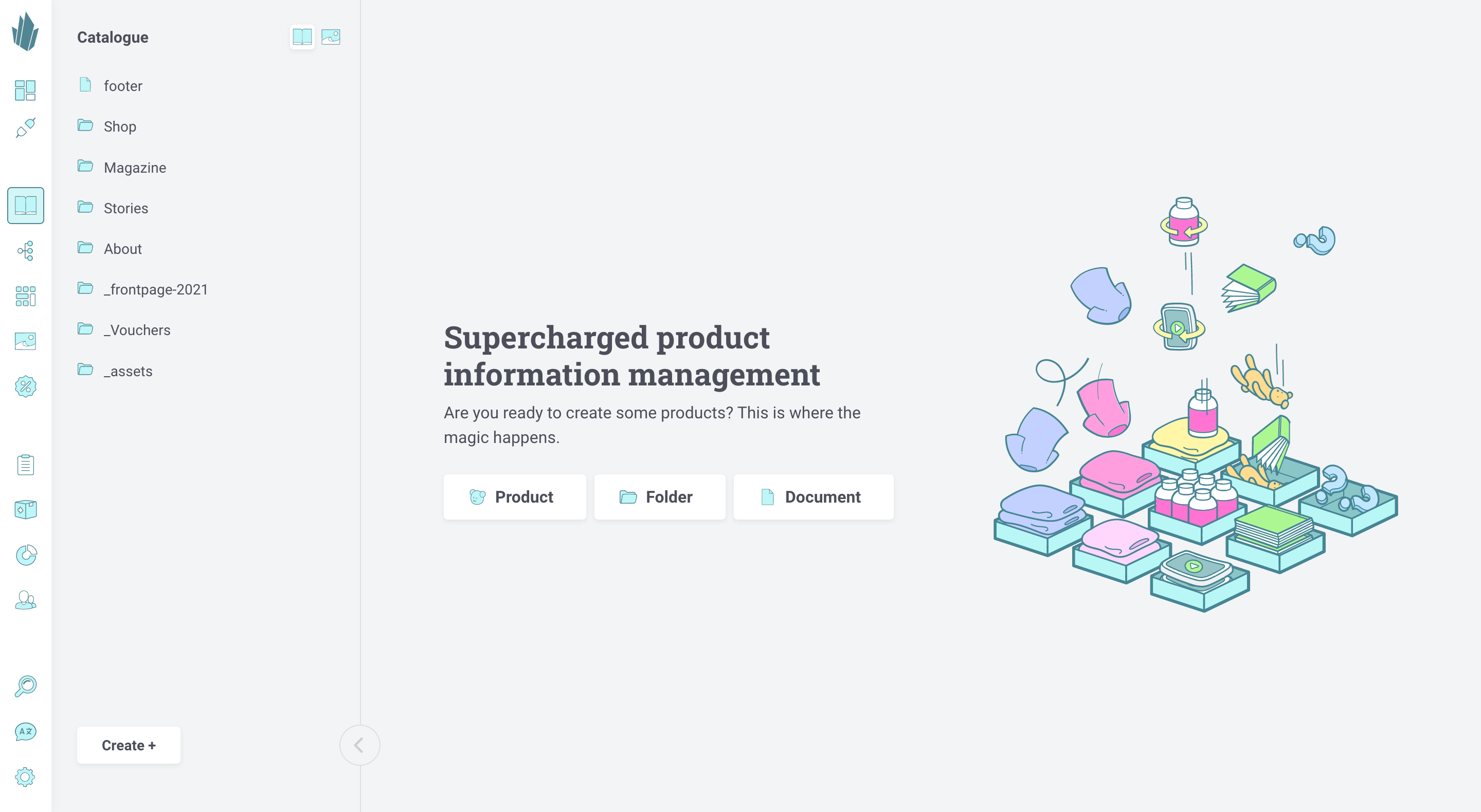
On the left side of the Catalogue window is a browser pane that lets you navigate through the hierarchical catalogue structure (once you’ve built it, of course). “Catalogue” is the root level. As you create folders and subfolders and browse down through them, your browsing path will be displayed at the very top of the browsing pane. You can click on the path names to jump back immediately to those levels without having to click the back arrow button (←) multiple times. You can also hide the browsing pane by clicking the left arrow button (<) at the bottom.
You can move items between levels of the catalogue by dragging them to the bottom of the pane, browsing to where you want to place them, and then dragging them back out. To reorder catalogue items, use the Paths view to adjust item priority.
Managing Catalogue Items
In the main Catalogue panel, you can create new items or edit existing ones. All items will be based upon the shapes that you’ve previously defined. If you haven’t done that step, go back and make sure you have all the shapes you need first.
You can create a product, document, or folder by clicking the Create + button in the bottom left, or by clicking the Product, Document, or Folder buttons in the middle of the screen. You can also bring up the command palette with [CTRL or ⌘] + K and type or select "Create item," then select the desired item type.
Read more about the specifics for these processes here:
To edit products or documents, you can simply click on them in the browsing pane to open them in the main window. To edit a folder, however, you need to hover over the folder until a pencil icon appears, then click on that icon. (If you click on a folder, you will browse into it.)
The pencil icon is also available for products and documents, and is displayed at the top of the catalogue browsing panel as well. Clicking on it will display the archive panel, a history of how the item has changed over time, and a list of flows the item is in, if any. For more information, refer to our documentation on archiving and flows. To return to the normal catalogue browsing pane, you can click the left-pointing arrow button (←) at the top of the archive panel. You can also click the catalogue button in the row of icons at the top of the panel.
The changes you make to items are automatically saved, but they’re not made publicly available until you hit the Publish changes button. Note that publishing items occurs asynchronously. There is no guarantee that the published item will be retrievable immediately after publishing it.
The action button (…) beside the Publish button allows you to Unpublish anything that’s already been published or Delete items completely. Anything you delete will be gone permanently, so proceed carefully.
Catalogue Views
There are different ways to view catalogue items, accessible from the Views drop-down menu at the top of the screen. The views available to you will depend on the type of item you’re viewing.
- Pretty View is the default view for products and documents.
- Nerdy View (products and folders only) is a spreadsheet view that allows you to work with multiple product variants at once. You can assign variants to price lists, update price variants and stock, and much more.
- Paths allows you to manage each item’s current and historical positioning within the catalogue, as well as how the item can be referenced.
- Developer View allows you to see useful programmatic information about an item.
- Flows View will show you what flow(s) an item is in and its progress over time. You can move the item to different flow stages or add comments to the activity log.
- Split View allows you to display editorial views side-by-side with one another. For instance, if you’ve set up a custom view, you may want to preview the changes you’re making to a catalogue item while editing it in Pretty View. Once you’ve selected Split from the Views drop-down, click the button on the pane that appears to choose the view you want to see. You can close either pane by accessing its Views drop-down and choosing Close split.
- Custom Views will contain the custom views that you’ve defined.
Catalogue Item IDs and Paths
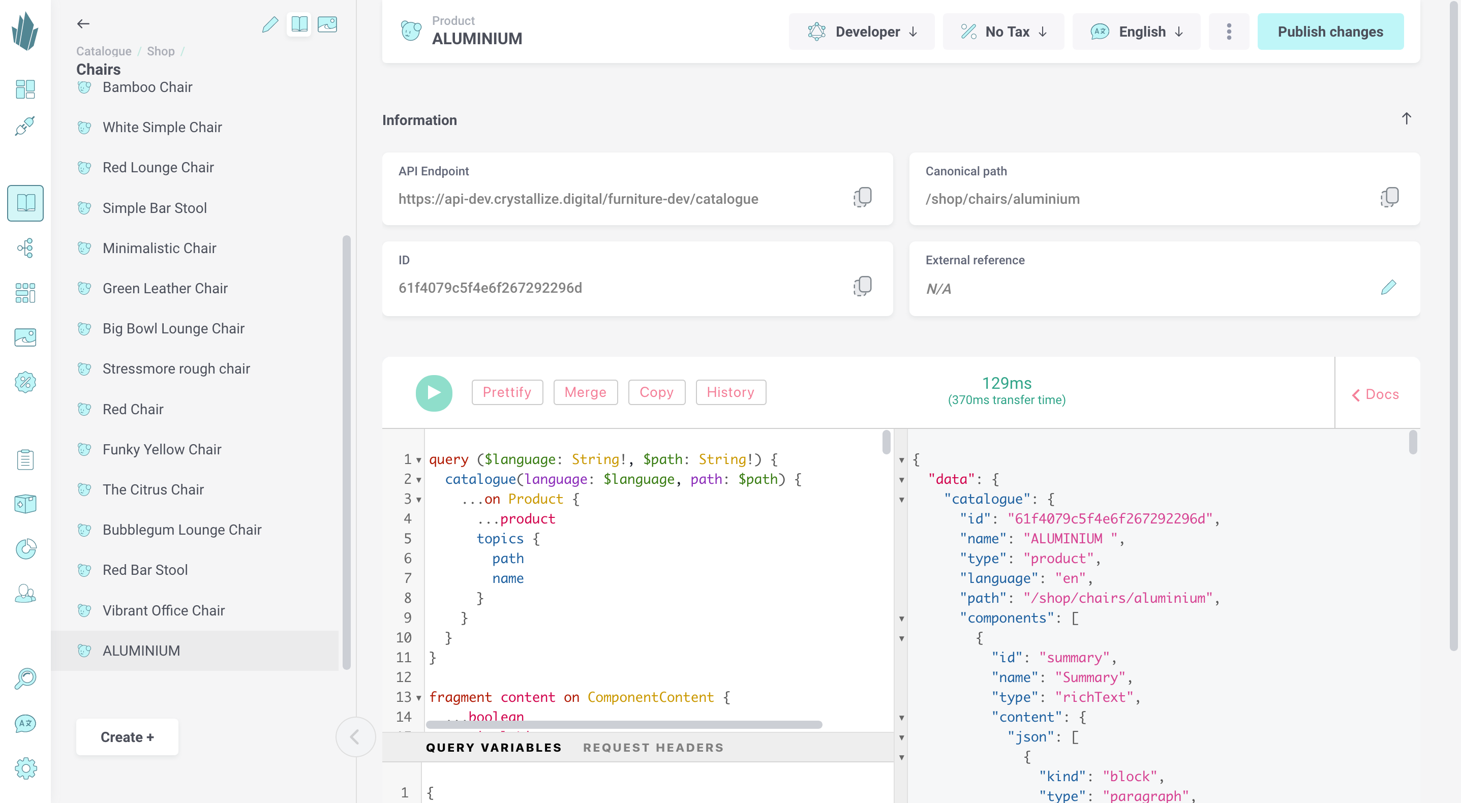
All items in the catalogue have an ID and canonical path associated with them, which is what a developer will use to reference particular items within programming. If you need the ID or path of any item, you can get it by opening up the item for editing, then choosing Developer from the Views drop-down menu at the top of the screen. You’ll be taken to the GraphQL playground, which shows a GraphQL query for retrieving this particular catalogue item and the corresponding JSON response. The Item ID and Canonical Path (once the item is published) are listed above the query window. The Copy to clipboard buttons allow you to copy these strings for use elsewhere. The path is also listed in the bottom left Query Variables window.
To return to the original item edit view, use the Views drop-down to choose either Pretty or Nerdy depending on the type of item you’re working with.
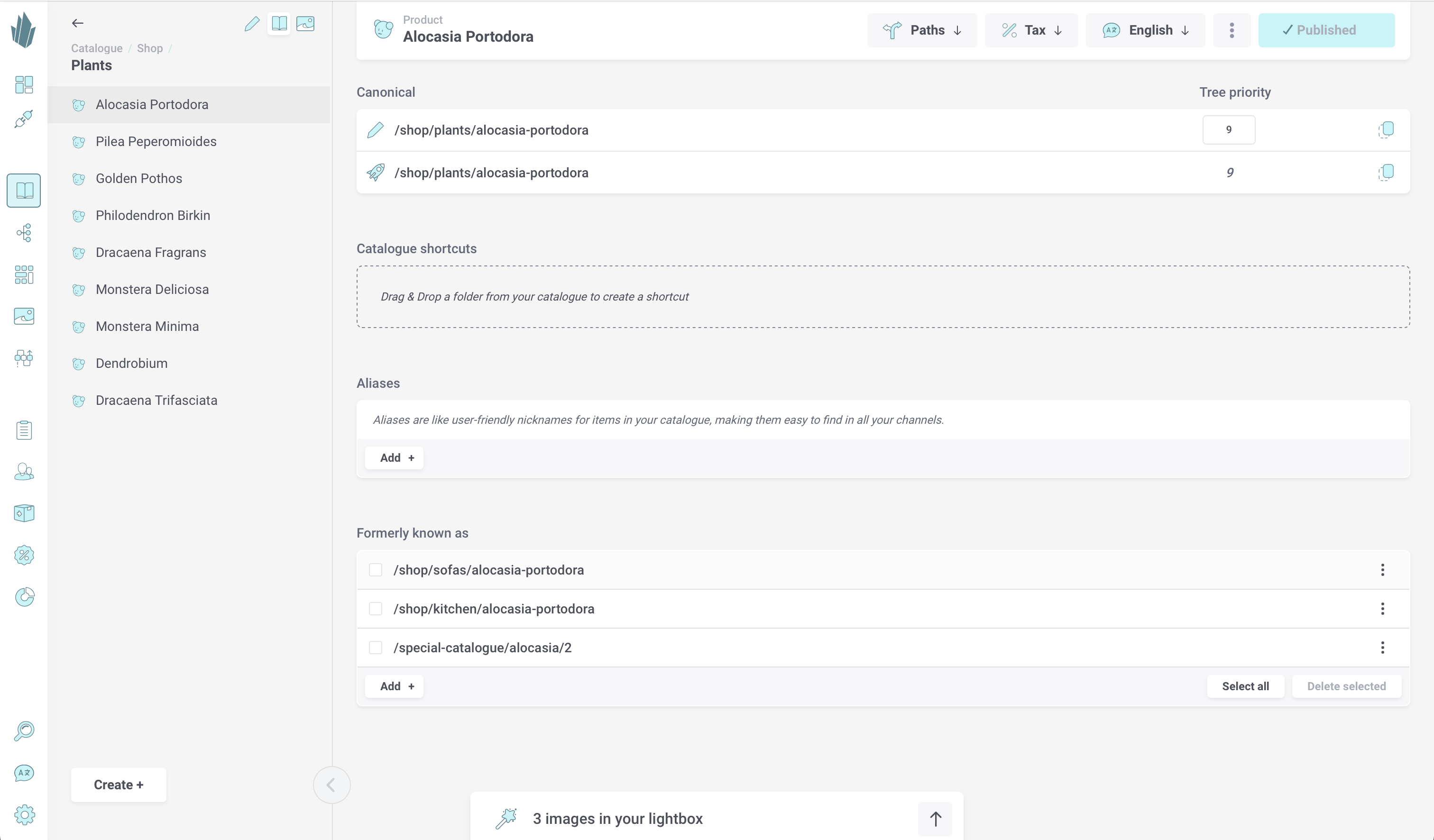
It’s possible for an item to reside in multiple places throughout the catalogue via shortcuts. Items can also be given aliases to make them easier to reference within URLs. To manage these additional paths, open the Views drop-down and select Paths. In addition to current paths and names, historical paths and names for the item are also displayed here.
To return to the original item edit view, use the Views drop-down to choose either Pretty or Nerdy depending on the type of item you’re working with.
Component IDs
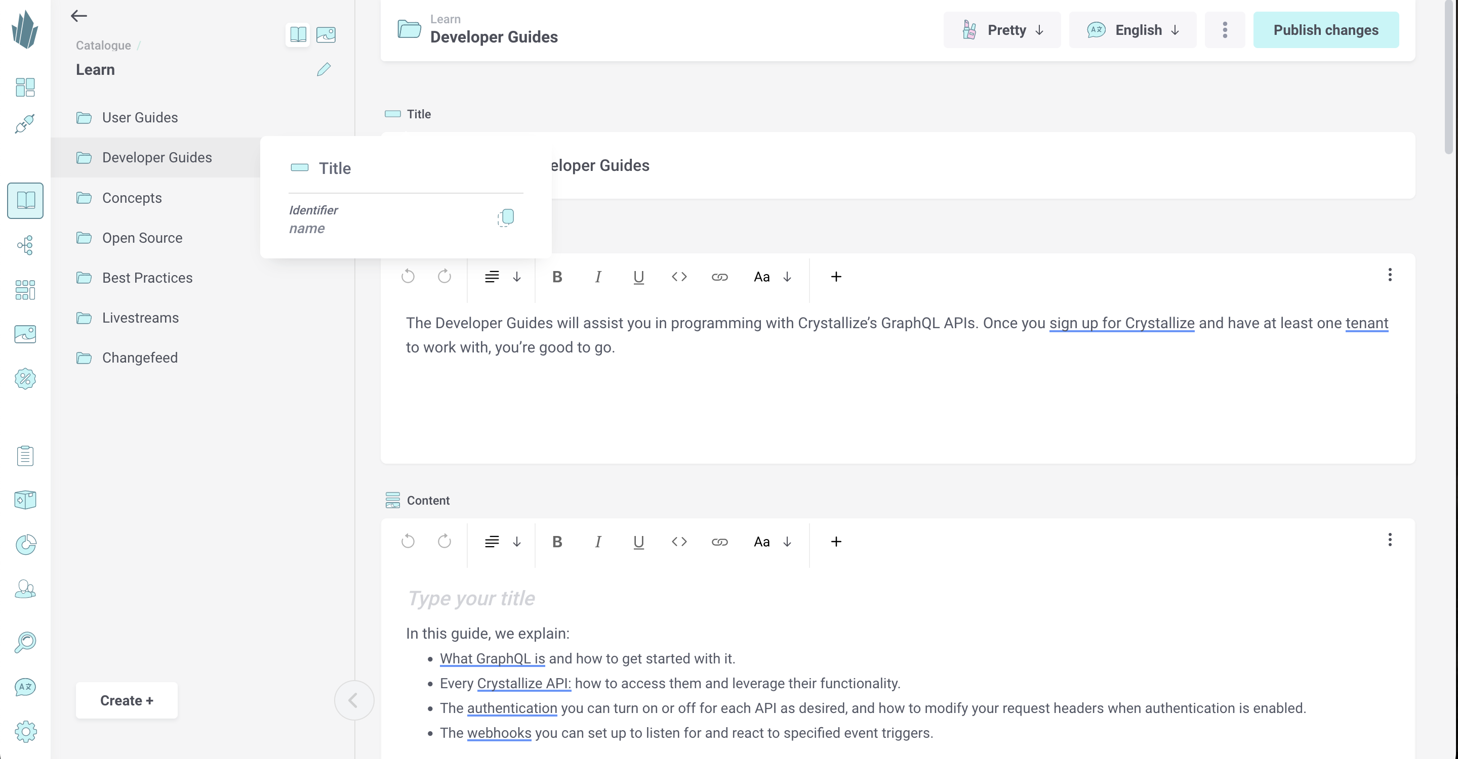
The components that make up your items have identifiers as well, which may differ from the components’ names. You may need the identifiers of various components for programmatic purposes. You can hover your mouse over a component’s name to reveal its identifier. There’s also a button that will copy the identifier string to your clipboard.
Catalogue Item Translations
If you’ve defined multiple languages for your tenant, then each catalogue item will have multiple translations. You can use the Language drop-down in the top right to switch between translations. Refer to our Configuring Languages page for more information.
Managing Assets
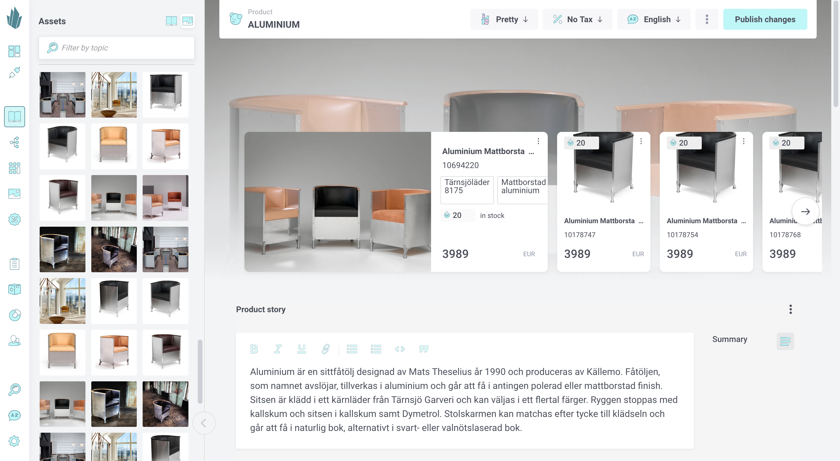
Crystallize’s Asset Organizer allows you to manage all of your tenant’s images in one place. Once uploaded, images can be tagged with topics, added to catalogue items, and more.
You can access the Asset Organizer directly from the catalogue. Simply click on the Assets button at the top of the left-hand browsing pane. You can add images to your catalogue items or add images to your lightbox to transfer them elsewhere. For more information, refer to our Magic Paste and Asset Organizer documentation.
Creating Topic Maps
You can categorize and define any sort of relationships between products by using topic maps. Learn more about creating topic maps here.
Creating Grid Organizers
This section of the User Guide also covers how you can create grids to group and display products in a non-hierarchical fashion.
